Cycle time reports
Modified 1 year ago
Abhiram
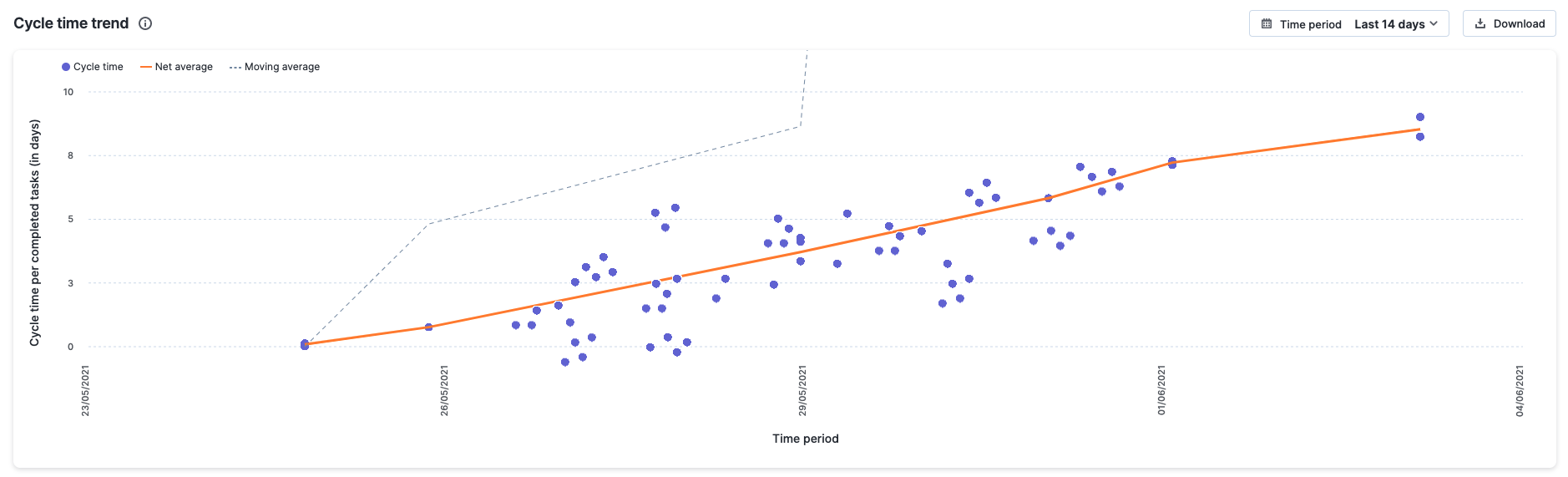
Cycle time trend
Cycle time is a metric that calculates how long it takes a task in your project to complete from start to finish. A cycle time trend report lets you quantify the cycle times of individual tasks and investigate outliers directly.

Accessing the cycle time trend report
Click Reports > Flow reports > Cycle time trend report from within your project to access this report.
This report is only available to project admins and members with whom the report has been shared.
Using the cycle time trend report
X-axis = The elapsed time
Y-axis = The cycle time per completed task (calculated in days)
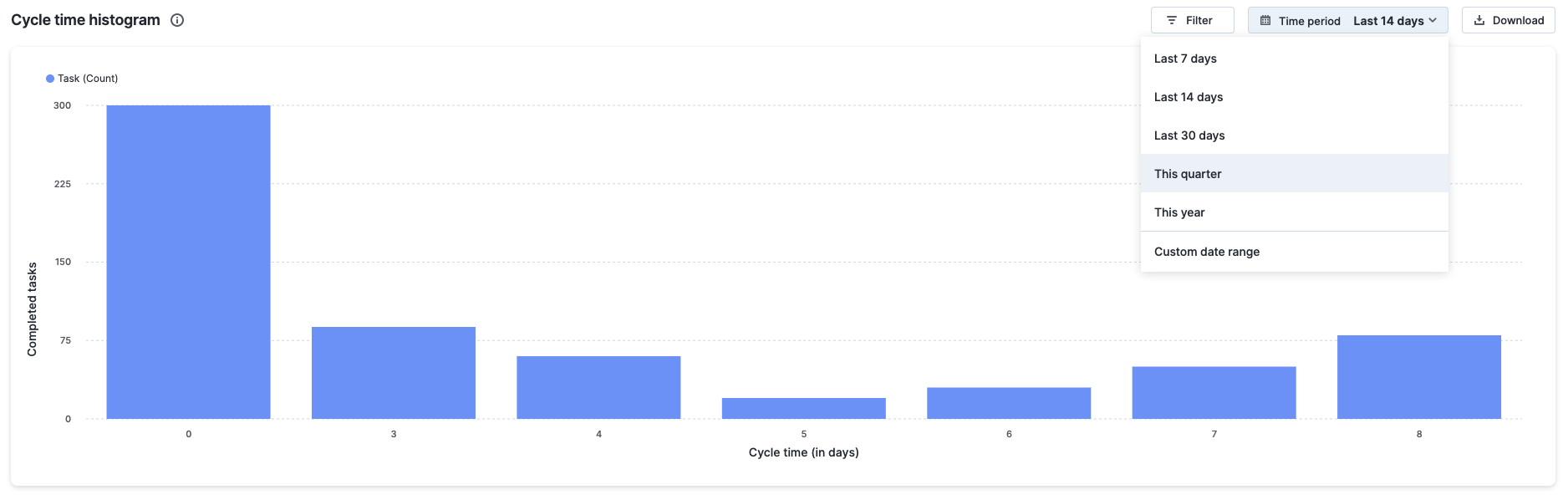
Time period – You can pick a relative or absolute time period for this report.
Relative time period:
- Last 7 days
- Last 14 days (default value)
- Last 30 days
- This quarter
- This year
Absolute time period: Any custom date range restricted to a period of six months.
The report can be downloaded in PNG format as needed. Each dot that you see scattered across the chart is a marker representing a task in your project. The dots' positions are determined by the date of completion and how long it is required for the task to reach the completed step. When you hover over a dot marker, you'll see the task ID, date of completion of that task, and its cycle time.
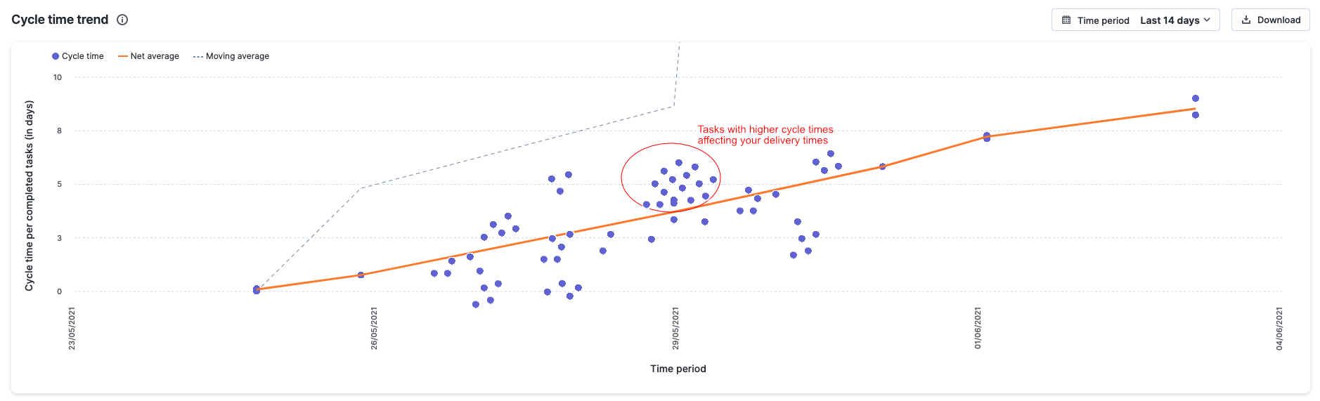
The trend curve shows the moving average over the five previous data point intervals and the trend line shows the net average for all cycle times. These trends help you identify any outliers at a glimpse.
Understanding the cycle time trend
This report can help you identify tasks with significantly longer cycle times. It can also provide a clear trend of your project's performance. A large number of tasks accumulating above the trend curves can be a concerning trend that demands close monitoring in order to identify underlying issues in your project.
Let's take a look at an example in which the cycle time trend report can be useful.
How can I identify task outliers affecting my overall project delivery during the last 3 months?
To obtain this information, go to the Cycle time trend report and select the time period as This quarter. If you notice a cluster of task markers scattered above the trend curves in the report, these indicate tasks that affected your delivery times.
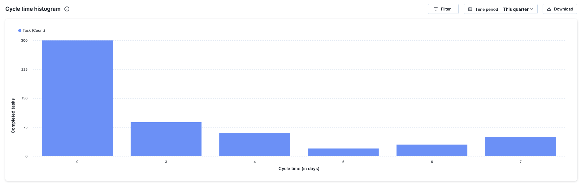
Cycle time histogram
This report shows the distribution of cycle times for your project. It also gives you actionable data that you can use to monitor the delivery performance of your project. The spread of the distribution indicates the volume and pace at which tasks are completed. Low cycle times indicate quick turnarounds, high cycle times indicate bottlenecks in your value stream.
Accessing the cycle time histogram report
Click Reports > Flow reports > Cycle time histogram report from within your project to access this report.
This report is only available to project admins and members with whom the report has been shared.
Using the cycle time histogram report
X-axis - The cycle time (in days)
Y-axis - The count of completed tasks in the project
You can narrow down your completed tasks by using basic and advanced filters.
The number of tasks with the same cycle time is shown in each column of the chart. The number of tasks that fall into it determines its height. For example, if the majority of your project's tasks had a cycle time of 5 days, the column representing this value will be the highest on your histogram.
Time period – You can pick a relative or absolute time period for this report.
Relative time period:
- Last 7 days
- Last 14 days (default value)
- Last 30 days
- This quarter
- This year
Absolute time period: Any custom date range restricted to a period of six months.
The report can be downloaded in PNG format as needed. When you hover over a column, you'll see the task count associated with your selection.
Understanding the cycle time histogram
Cycle times, which are heavily distributed to the left of your report in this report, show that most tasks were started and completed quickly. An even spread (without a long tail) on the histogram is a dangerous trend that indicates project instability.
Let's take a look at an example in which the cycle time histogram can be useful.
How can I understand the delivery performance of my project over the last 3 months based on the cycle times of tasks?
To obtain this information, go to the Cycle time histogram report and select the time period as This quarter. The histogram data depicts the project's overall distribution of cycle times. If the histogram shows a bell curve or a left-leaning arc, this indicates that most tasks are started and completed quickly. On the other hand, an even spread (without a long tail) on the histogram is risky and indicates that the project is too changeable.