
 User guide
0
Popup

Introduction
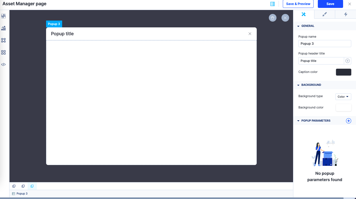
The popup component lets you add popups to your page. A popup is a small window that appears over the existing page on an action. Each popup component contains a popup header and a popup container.
How to use it?
Once you drag and drop the popup component, the popup window opens up and you will be able to perform the following actions:
- Modify the popup name, popup header title, and caption color.
- Background type can be set as a color or as an image.
- Popup parameters can be added and the parameter type can be set as a number or text.
- In Style properties, you will be able to adjust the sizing, modify the padding and margin, and set the border size, color, and radius.
- In Event properties, you will be able to add the event “On open” and “On close” to direct the popup to perform an action.
There are two actions that can be performed:
- Redirection - This action redirects you to the user-defined pages, the system-defined home page, or lets you go back to the same page.
- JavaScript action - The JavaScript action lets you define the action that you want to perform using JS code.
Popups can be linked as an event to other components such as buttons, cards, and tabs.
Content aside
Related Articles