
 User guide
0
Tab

Introduction
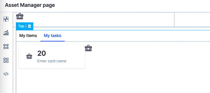
A tab component lets you categorize content into different tabs. Using a tab container, you can create a horizontal navigation bar with individual tabs having a container(link) of its own. It basically lets you create a secondary navigation for your application.
How to use it?
Once you drag and drop the Tab component, you will be able to perform the following action:
- Choose a tab style for the tab.
- Under Tab settings, you can:
- Edit the tab name.
- Make a particular tab as the default tab.
- Add additional tabs.
- Set the color, active color, and hover color for the tab.
- In Style properties, you will be able to adjust the sizing, modify the padding and margin, and set the border size, color, and radius.
- In Event properties, you will be able to add the event “On Tab change” to direct the tab to perform an action.
There are three actions that can be performed:
- Redirection - This action redirects you to the user-defined home page, the system-defined home page, or lets you go back to the same page.
- Open popup - The open popup action lets you open a popup that you had created using the Popup(add link) component.
- JavaScript action - The JavaScript action lets you define the action that you want to perform using JS code.
Content aside
Related Articles