
 User guide
Tabular reports

Tabular reports display information in columns and rows, forming a grid similar to a spreadsheet.
Creating a tabular report
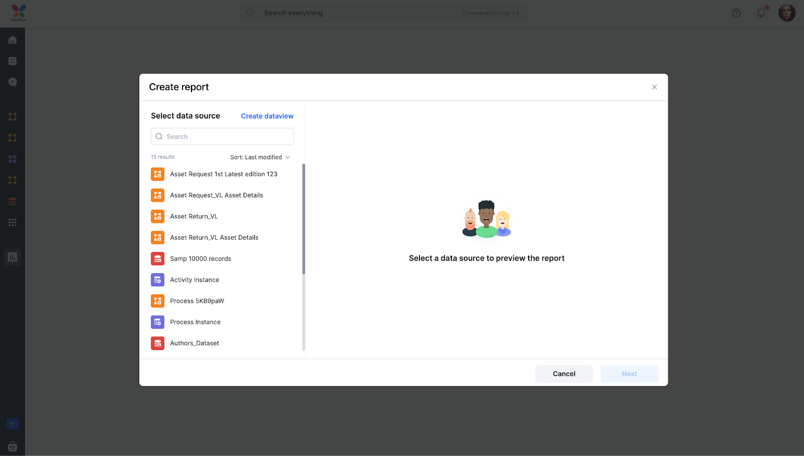
Click the Create Report button (
)on the Analytics page.
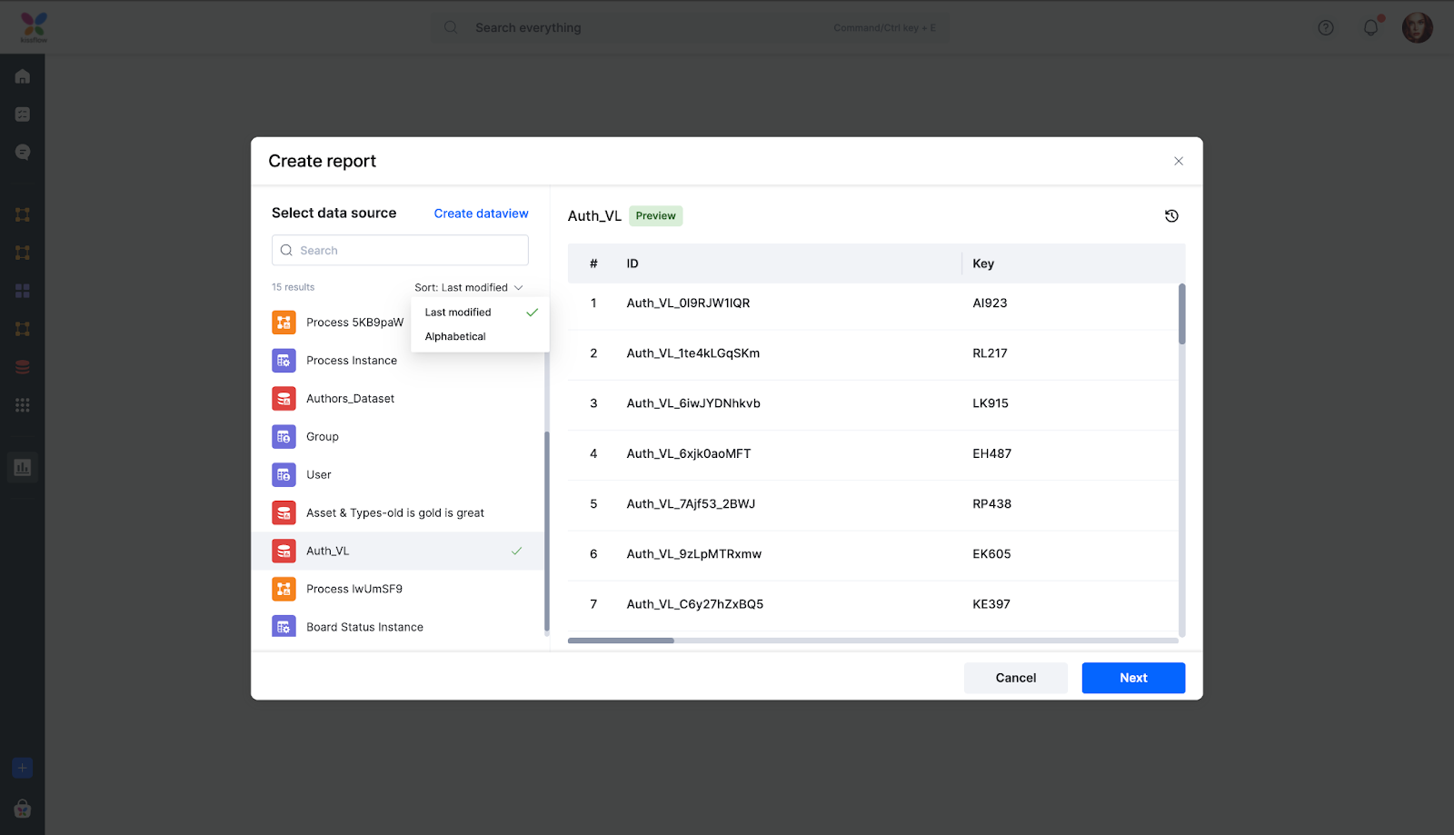
Select the data source.
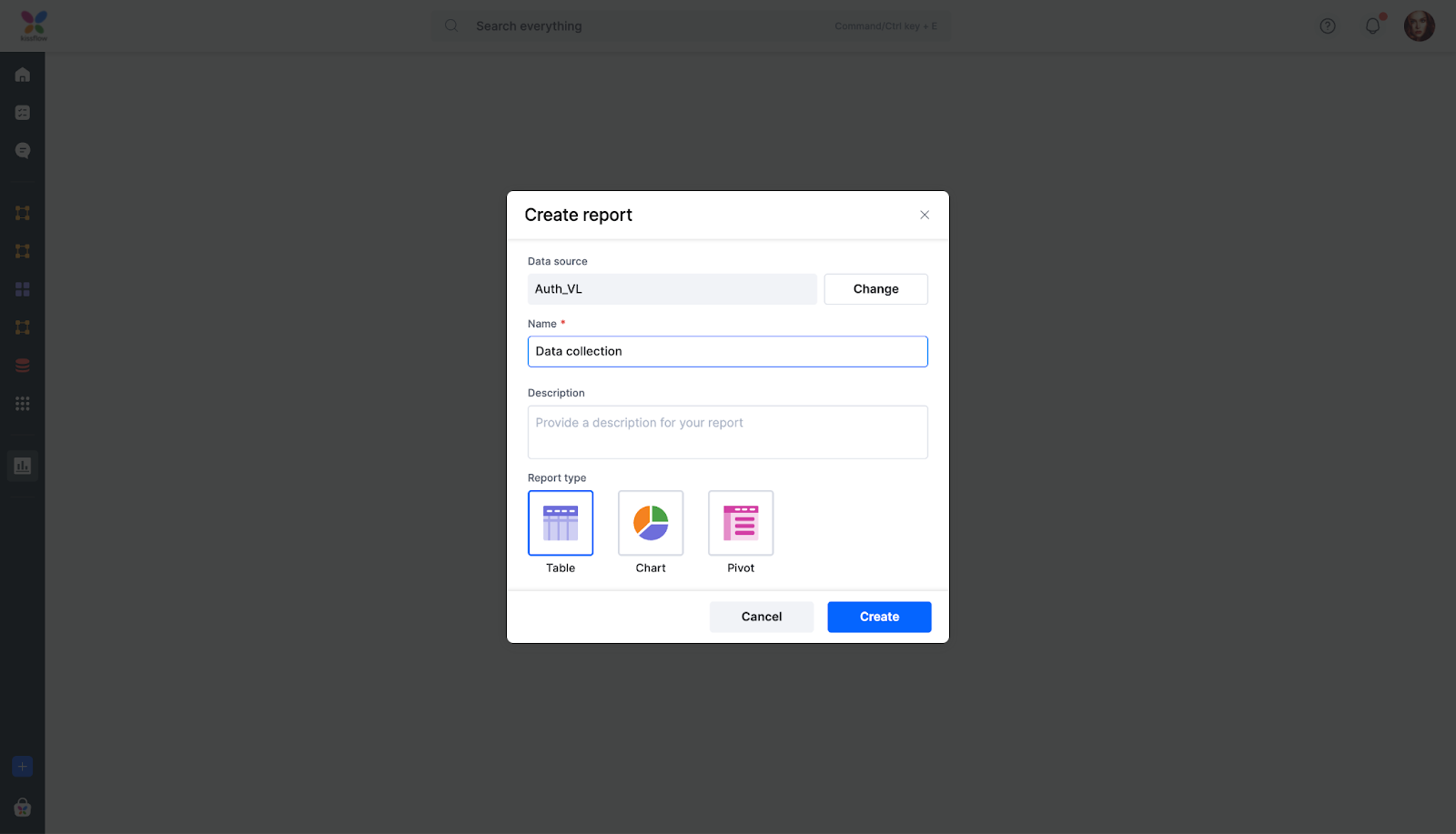
Provide a name and select the type of report as Table.
Click Create.
Settings configuration
You can configure a report to customize the way data is presented in a report. You can determine which fields are displayed. Additionally, adding filters and sorting lets you narrow down the data, making it easier to analyze and draw insights.
Selecting fields
In the field selection, you can do the following:
- Click the (+) button to add the required fields as columns from the data source.
- To select all fields, click Select all.
- To remove all fields, click Clear all.
- To remove a field, click the Delete button (
).
- Click the drag-and-drop icon to drag and drop columns.

Filtering data
To narrow down specific data in your report, you can add filters.
- Click the Add advanced filter button.
- Choose the fields you want to use based on your filter and enter the conditions.
- Click + Add a filter button to add more filters and conditions to the report.
- The new condition can be either AND (all conditions must be met) or OR (any one condition must be met). Click (-) to remove a condition or (x) near a filter to remove the filter.
- The changes can be saved by clicking Apply.
- To reset all added filters, click Clear.
- Click the Close button (X) on the top corner to discard the changes.
Sorting data
You can organize the data by applying Sort to your report.
- Choose a field in which you want to sort the report.
- Select the sort type as Ascending or Descending. To sort the report in the default order, click the None option. Once done, the report will arrange itself in the original data source order. You will see a sample set of 10 rows in the report preview on the left.
- Click Save to apply the changes you have made in the Settings tab.

Applying styles to tabular reports
Format the column header, rows, and cells of your report to suit your preferences. Choose the Normal state for the default appearance and the Hover state to preview styles on hovering.
Header section: Customize the background color, font size, font color, font weight, and icon color of the column header. The font weight dropdown provides options like Regular, Medium, and Semi-bold.
Row settings: Adjust the Font size, Font color, Font weight, Line height, Letter spacing, Border color, and Border bottom width for the rows in your tabular report.
Cell customization: In the cell section, fine-tune the padding of your report cells. Utilize padding options to control overall padding and individual padding sizes on each side of the cell.

Other actions
Once you have configured and saved your report, you can perform the following actions in runtime:
- Sort: To sort the data based on the fields in your report. To sort the report in the default order, click the None option.
- Filter: To add the required filters to highlight items based on your chosen parameters.
- Show/hide fields: To select which fields you want to display on the current layout.
- Export: To export your report in CSV or JSON format.
Use case
Suppose you want to create a simplified view of the datasource named Purchase catalog. In this case, you can create a tabular report as it displays data in rows and columns in a simple table. One example of such a use case is to track sales data. Information such as the number of products sold, the total sales revenue, and the sales by product category can be used to identify trends in sales.
However, if you want to create a specific report that summarizes and analyzes data in a variety of ways including values, you can choose Pivot report.