
 User guide
Chart reports

Charts offer a graphical representation of the data in reports. The following are the six major types of charts: area, bar, doughnut, line, pie, and scatter chart.
Additionally, there are ten different chart options available for your specific needs.
- Area chart
- Stacked area chart
- Horizontal and Vertical bar charts
- Stacked horizontal and Stacked vertical bar charts
- 100 percent stacked horizontal and vertical bar charts
- Line chart
- Combo chart
- Scatter chart
- Pie chart
- Doughnut chart
Creating a chart report

- To create a chart, naviagte to the Reports tab on the Analytics page.
- Click the Create Report button.
- Select the data source.
- Provide a name and select the type of report as Chart.
- Click Create.
Select Auto when unsure what kind of chart to choose, and Kissflow will make the best one for you.
Configuring a chart report
In the Configure report section, select the chart type, click + Add fields, and select the required fields for dimension, measure, and legend. You can remove a field by clicking the Delete button (![]() ). Adding a Filter is similar to that of tabular reports. Select the scale type and the required labels. Click Save to configure the report.
). Adding a Filter is similar to that of tabular reports. Select the scale type and the required labels. Click Save to configure the report.

Settings
To configure the report, choose the fields you want to display on the right panel.
- Dimension is the primary field you want to use to compare data. For graphical charts, it will be the x-axis.
- Measure is the other field(s) you want to use to compare data in a collective manner. This is the y-axis in graphical charts. You can display multiple measures in the same chart.
- A legend is the area in the chart describing each part of the chart and will be visible only in auto, horizontal, and vertical charts.
Type of scale
There are two types of scale:
- Linear scales are the default scale type and show the scale in equal increments.
- Log (Logarithmic) scales show the increment in multiples of the previous one, such as double or ten times its size.
Labels
You can choose which labels you want to display on your chart.
- X-axis is horizontal on most charts except for horizontal bar charts, where the X-axis is vertical.
- Y-axis is vertical on charts except for horizontal bar charts, where the Y-axis is horizontal.
- Data labels display the information on the line item or bar. Hover over the chart to view the label that will be displayed.
- Legends are explanations of the symbols used in the chart. It is located on the top-left of the chart.
Adding filters
To narrow down specific data in your report, you can add filters. Click the Add advanced filter button to add a filter. Choose the fields you want to use based on your filter and enter the conditions.
Click + Add a filter button to add more filters and conditions to the same field. The new condition can be either AND (all conditions must be met) or OR (any one condition must be met).

Sorting data in a chart report
You can organize chart data in the order you want it to appear in your report. To sort a chart report, go to Sort on Configure report page > choose the required field in which you want to apply Sort > select whether you want the ascending or descending order > click Save.

To sort a chart after creating a chart report, follow these steps:
- Click the Sort button (
 ).
). - Choose the required field in which you want to apply Sort.
- Select whether you want the order to be ascending or descending.
To set the chart in the default order, click the None option. Once done, the chart will be arranged in the default data source order.

Applying styles to charts
Under the Style tab, you can choose from the 10 different color variants to customize your charts.

Actions in charts
Once you have configured and saved your chart, you can perform the following actions:
- Edit the chart to make changes to the current configuration.
- Share charts with others in your account.
- Use the legend to control its appearance. Click the legend to add or remove the series.
Types of charts
- Line chart uses lines to represent changes to data over a period of time. The y-axis displays the value which is the measure, and the x-axis indicates the variable which is the dimension.

- Area chart functions similarly to a line chart but with the areas below the lines filled in. For example, here, it shows which department has spent the most PR amount. You can use this chart to show how values develop over time.

- The Stacked area chart is an area chart that includes a stack of multiple areas. It can be used to compare development or trend over time.

- Horizontal bar chart shows a comparison among different items.

- Vertical bar chart similar to the horizontal bar chart also shows a comparison among different items.

- Stacked chart consists of the total divided into parts (present in legend) for each category. It helps effectively display and compare the proportion of different data series within each category. You can create a Stacked horizontal bar chart and a Stacked vertical bar chart based on your preference.

- 100 percent stacked chart shows the percentage of multiple data in stacked columns, where the total of stacked columns always equals 100 percent. You can create two types of 100 percent stacked charts: 100 percent stacked vertical bar chart and 100 percent Stacked horizontal bar chart.

- Combo chart lets you compare two measures, one shown as a vertical bar and one shown as a line.

- Scatter chart shows the relationship of the variables (measures) of a chart. In the below example, the chart shows how many units of inventory was sold or on hand for each item.

- Doughnut chart expresses a part-to-whole relationship, where all pieces represent 100 percent.

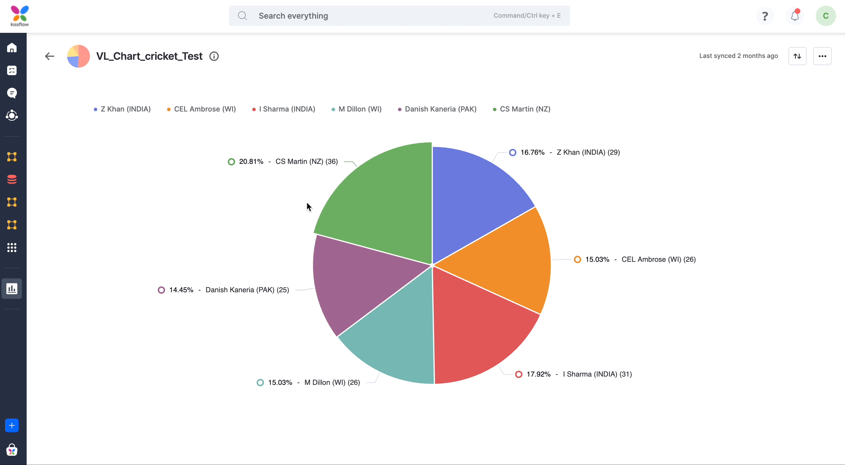
- Pie chart is similar to doughnut charts but with the middle area filled in.
