Throughput report
Modified 1 year ago
Abhiram
Throughput is the amount of work you’ve delivered in your project during a specific time period. The project throughput chart helps you assess the productivity of your project by monitoring the tasks completed at regular intervals.
The throughput indicates only completed tasks; work in progress and backlog tasks are not taken into account. The report also lets you detect anomalies using moving averages and other typical trends specific to your project.
Accessing the project throughput report
Click Reports > Flow reports > Project throughput report from within your project to access this report.
This report is only available to project admins and members with whom the report has been shared.
Using the project throughput report
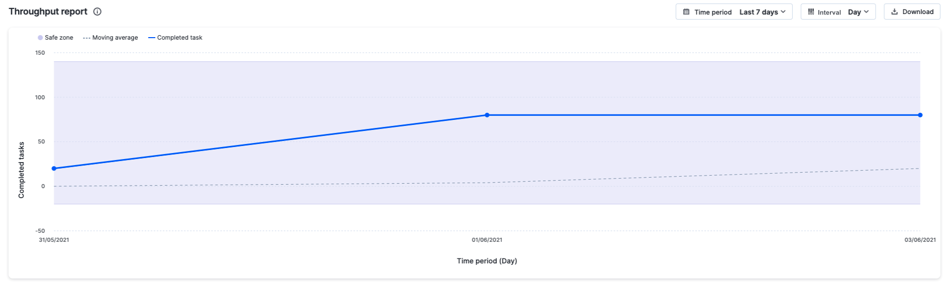
X-axis = The elapsed time with granular time interval
Y-axis = The count of tasks (in completed step only)
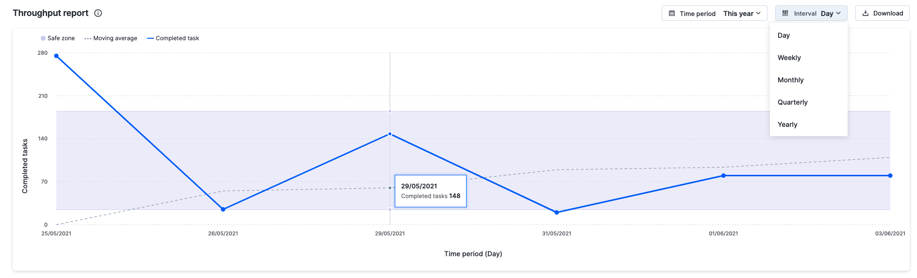
Time period – You can pick a relative or absolute time period for this report.
Relative time period:
- Last 7 days
- Last 14 days (default value)
- Last 30 days
- This quarter
- This year
Absolute time period: A custom date range during the past 3 months
Time interval – Any custom date range restricted to a period of six months.
- Daily (default value)
- Weekly
- Monthly
- Quarterly
- Yearly
Apart from the trend line, there’s also a trend curve that shows the moving average over the five previous data point intervals. The line should stay even or increase smoothly within the specified safe zone. The report can also be downloaded in PNG format as needed. When you hover over the trendline, you can see the number of completed tasks during the selected time interval.
Understanding the project throughput report
The project throughput report tracks how much work your team delivers in your project and detects anomalies using trend graphs.
Let's look at an example to see how the project throughput report can be used.
How can I understand the productivity of my project during the past 7 days?
Go to Flow Reports > Throughput report, select the Last 7 days as the time period and select the time interval as daily. The report will be depicted as a trendline showing the number of completed tasks per day over the past seven days. If the trendline increases smoothly within the safezone, your team can be considered as productive. If the trendline goes down, this means that your team is struggling to deliver results. This indicates bottlenecks preventing your team from delivering consistently.