Cumulative Flow Diagram
Modified 1 year ago
Abhiram
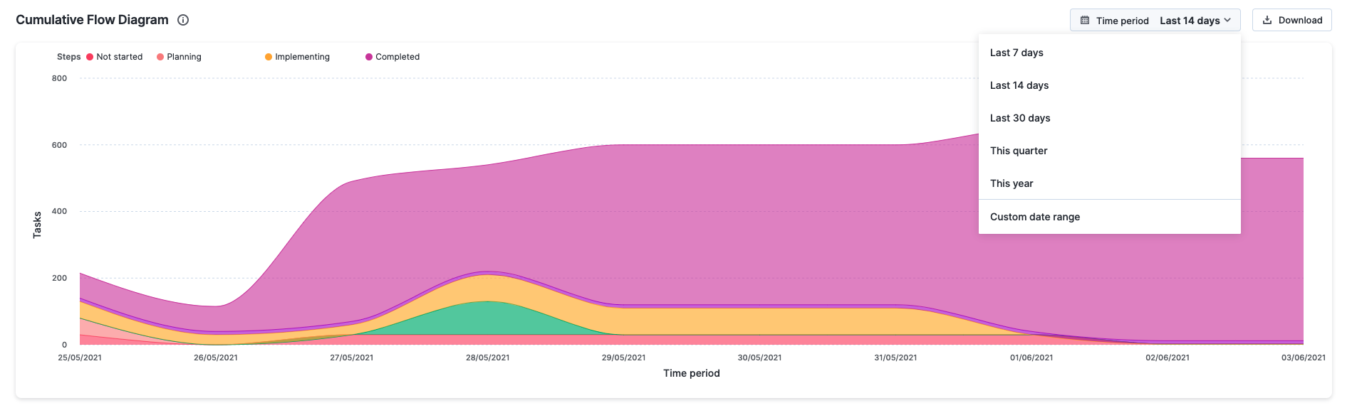
Cumulative Flow Diagram (CFD), also referred to as the burn-up chart, is an analytical tool to visualize the stability of your project over time, and predict potential problem areas slowing down your project. It shows data in a stacked area chart, conveying the flow and volume of all the tasks across all the steps in your project in one glance.
Accessing the CFD report
Click Reports > Flow reports > Cumulative Flow Diagram from within your project to access this report.
This report is only available to project admins and members with whom the report has been shared.
Using the CFD report
X-axis = The elapsed time
Y-axis = The number of tasks
Time period – You can pick a relative or absolute time period for this report.
Relative time period:
- Last 7 days
- Last 14 days (default value)
- Last 30 days
- This quarter
- This year
Absolute time period: Any custom date range restricted to a period of six months.
If your project has five steps, the CFD report will display them as five colored area charts stacked from top to bottom, each displaying the total volume of work in each step.
The report can be downloaded in PNG format as needed. Tasks in the in progress and completed steps are color coded and identified by legend markers in these charts. When you hover over a chart, you'll see the task count associated with your selection.
Understanding the CFD report
Let's take a few examples to understand how the CFD report can be used.
How to identify the flow and volume of tasks across steps?
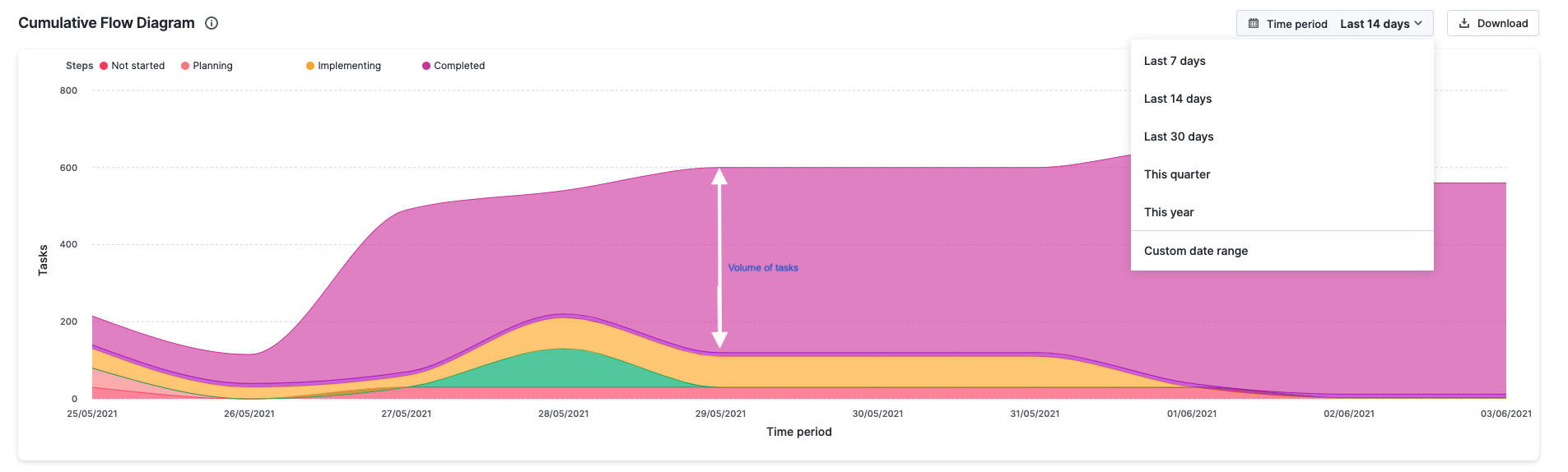
To get this data, go to the Flow report > Cumulative Flow Diagram. In the report, the top line of each area chart on the CFD report represents when tasks enter the respective step of your project, while the bottom line shows when they exit the step. The more tasks in that step, the wider the width of the stacked area chart. The width of individual area charts give a clear indication of the volume and how the tasks flow through these steps.
How to identify the stability of my project over the past one year?
Go to the Flow report > Cumulative Flow Diagram. Select the time period as This year. The band progression in the CFD report will help you understand if your project is stable or not.
When bands progress in parallel
This is the ideal outcome and shows that new tasks are entering your project in parallel to those that are leaving it.

When band is rapidly narrowing
This means that the throughput of the step it represents is higher than the new tasks entering the project. This indicates that you have more capacity than you need at this time and should relocate it to improve the flow.

When the band is rapidly widening
This is a sign of more tasks entering the corresponding step of your project compared to tasks leaving it. This may be due to multitasking and other activities that don’t generate any value. To correct this trend, you must focus on finishing tasks that are in progress before starting new ones.
